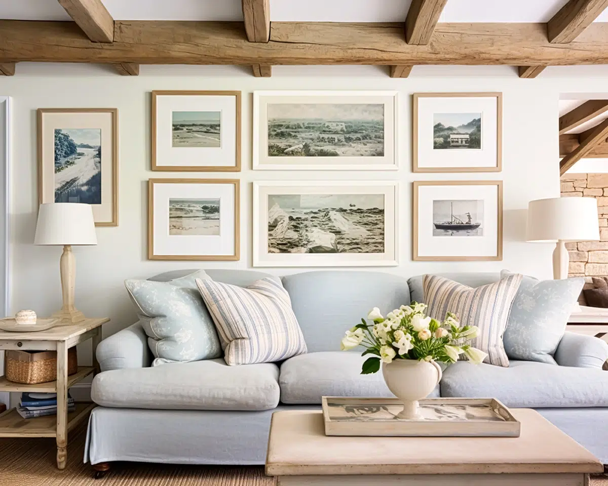
Coastal art has always promised escape, but the recent appetite for oversized pieces suggests something more specific: control over atmosphere. In a living room or a hotel lobby, a large shoreline scene can operate like architecture, changing how a space feels long before anyone notices the furniture. The appeal is not only the subject matter of sea and sand, but also the way scale amplifies calm. A wide horizon line pulls the eye outward, and the room seems to exhale with it. In that sense, coastal art is less décor than mood engineering.
What has changed is the sophistication of the category. Coastal no longer means only a literal beach photograph or a cheery lighthouse. Collectors and casual buyers alike are gravitating toward nuanced palettes, layered textures, and styles that borrow from contemporary abstraction, vintage travel posters, and even minimalist color-field painting. The best large coastal works do not shout “vacation.” They imply it through light, negative space, and the suggestion of weather moving across water.
Scale also brings honesty. A small canvas can get away with cliché because it reads as an accent. A large piece must hold attention from across the room and from a few feet away, which means the brushwork, printing quality, and composition have to stand up to scrutiny. When coastal art is done well at size, it offers both an immediate impression and a second act of details. You notice the spray, the grain of sand, the soft blur of a distant pier. The image becomes a place you return to, not a theme you tolerate.
The Coastal Spectrum: Ocean Views Versus Shoreline Scenes
“Ocean views” and “shoreline scenes” sound interchangeable until you live with them. Ocean views tend to prioritize distance and openness, often cropping out land entirely or reducing it to a thin strip. They rely on the drama of sky, shifting blues, and the clean geometry of a horizon line. In large formats, these works can make a room feel taller and more expansive because the eye is invited to travel. Their emotional register is typically meditative, with a touch of the sublime.
Shoreline scenes, by contrast, bring you closer to the ground. They may include dunes, grasses, rocks, shells, boardwalks, or foam curling onto wet sand. The viewer is positioned at the edge where water meets land, which introduces texture and narrative. A shoreline piece can feel more intimate and lived-in, as if you can hear footsteps or smell salt on a breeze. At large scale, those tactile elements become the primary pleasure, and the room gains warmth rather than pure spaciousness.
The choice between the two is often about what the space needs. Ocean views can simplify busy interiors and cool down warm color schemes, especially when the sky carries grays or pale aquas. Shoreline scenes can soften modern rooms that feel too sharp, adding organic shapes and an implied story. Both styles can be serene, but they achieve serenity through different routes. One is about the infinite, the other is about the immediate. Knowing which you want is the first step toward selecting a piece that looks intentional rather than merely coastal.
Scale as Strategy: Why “Large” Changes Everything
Large coastal art behaves differently from small coastal art because it changes the room’s visual hierarchy. The work becomes the anchor, and everything else negotiates around it. A big seascape makes a sofa feel more grounded, a dining area more deliberate, and an entryway more cinematic. It also influences lighting choices, since glare and shadow are more noticeable on a large surface. In short, scale turns a picture into a design decision. When the piece is truly oversized, it stops behaving like an accessory and starts acting like a window, even in rooms without a view.
The technical side matters, too. Enlarging an image increases the visibility of grain, banding, and soft focus. That is why painterly styles and textured approaches often outperform hyper-detailed photography at very large sizes, unless the photo is captured and printed with exceptional quality. On the other hand, minimalist compositions can look surprisingly luxurious in oversized formats because the simplicity reads as confidence. Large coastal art thrives when it is built for distance and for intimacy at once. You want a strong read across the room and enough nuance up close to avoid visual fatigue.
Once you know you are buying big, the shopping process benefits from structure. Start with the feeling you want, then translate it into decisions about horizon, palette, and subject before you compare size, surface, and framing for your light and sightlines. That method naturally leads you to curated art marketplaces where scale and materials are clearly presented. For instance, iCanvas, a Chicago-based wall art company, offers ready-to-hang work from independent artists, licensed estates, and cultural institutions across canvas, fine art paper, acrylic glass, wood, and metal. If you are leaning toward shoreline-driven pieces, explore their oversized coastal canvas prints to compare styles side by side before committing.
Photorealism and the Modern Seascape
Photorealistic coastal art has a straightforward promise: you are there. The best examples capture the way light fractures across water or how fog erases edges along a distant shoreline. At large sizes, photorealism can create a window effect, especially when the perspective is level and the horizon line is stable. This style tends to work well in contemporary interiors because it feels crisp and direct. It also pairs naturally with neutral palettes, letting the sea tones do the heavy lifting.
Yet photorealism is not always about sharpness. Many of the most sophisticated coastal photographs lean into softness, long exposure, or a restrained contrast curve that mimics memory. A blurred surf line can feel more like meditation than documentation. In a large print, that softness becomes a design tool, smoothing out a room that has too many hard edges or competing patterns. The key is that the image must still have structure, such as a strong horizon, a clear value gradient in the sky, or a compositional focal point like a breaking wave.
When choosing photorealistic large coastal art, consider the emotional temperature. Cool blues and silvers can make a room feel quieter, sometimes even more formal. Warmer coastal photography, with late-day sun and amber sand, can make the same room feel inviting. Also think about your viewing distance. A hallway benefits from a photo with a clear read from close up, while a living room can handle subtle tonal shifts that unfold over time. Photorealism is powerful, but at large scale it demands careful editing and excellent print execution.
Impressionist and Painterly Shores
Painterly coastal styles trade literal accuracy for sensation. They emphasize brushwork, movement, and the feeling of wind and light rather than the exact contour of a shoreline. In large formats, these works excel because the gestures become immersive. You can see the sweep of a brush that suggests surf, or the layered strokes that mimic a cloud bank forming offshore. The scene feels active, even when the composition is calm.
Impressionist coastal art also offers a forgiving elegance in mixed interiors. Because edges are softened and colors are blended, the piece can coexist with patterned rugs, textured upholstery, and collected objects. It does not compete with your room’s details so much as unify them. Many painterly shore scenes use a limited palette, such as seafoam, sand, and a muted slate sky. That restraint prevents the “beach house cliché” effect while still delivering coastal character.
To make this style feel current, look for contemporary compositions. A cropped view of dunes with a high horizon can feel modern, as can a shoreline scene that focuses on reflection rather than waves. Texture is your ally here, especially on surfaces that hold depth. The goal is to choose a painterly work that reads beautifully from across the room and rewards you when you walk closer. Large coastal art should have that double life, and painterly approaches often deliver it naturally.
Abstract Coastal: Color, Horizon, and Mood
Abstract coastal art is sometimes misunderstood as coastal in name only. In reality, it can be the most precise translation of the shoreline’s emotional effect. Instead of painting a beach, the artist builds the experience using bands of color, atmospheric gradients, and rhythmic marks that suggest tide and wind. A single horizontal line can carry the entire narrative. At large scale, that simplicity becomes commanding and quietly expensive-looking.
This style is especially useful when you want coastal without coastal props. Abstract pieces can live comfortably in urban apartments, modern offices, or minimalist homes where a literal beach scene might feel out of place. They tend to rely on a small set of hues, such as chalky whites, gray-blues, and soft greens, which makes them easy to integrate. The room gets the calm of the sea without the suggestion of themed décor. Abstract coastal works also pair well with natural materials like linen, light wood, and stone.
The difference between a strong abstract coastal piece and a forgettable one is intention. Look for balanced proportions between sky and sea, thoughtful transitions, and a focal detail that breaks the monotony. Sometimes that detail is a textured ridge of paint. Sometimes it is a subtle shift in value that makes the horizon feel luminous. Large abstract coastal art can be transformative, but only if it has enough structure to hold your attention day after day.
Vintage Coastal and Nautical Americana Without the Kitsch
Vintage coastal art includes travel-poster graphics, antique map references, and mid-century beach imagery that nods to nostalgia. Done well, it can feel like inherited charm rather than novelty. The appeal comes from typography, flattened shapes, and a deliberate sense of time. In a large format, these works become statement pieces, often adding personality to spaces that feel too polished. They can also bring warmth into rooms dominated by modern lines.
The risk is tipping into kitsch. Anchors, overt nautical symbols, and overly literal signage can look like themed retail displays when enlarged. The stronger approach is to choose vintage-inspired art that is subtle in its references. A faded palette, a minimalist sailboat silhouette, or a coastal town scene rendered with restraint can feel authentic. The goal is to evoke history, not imitate a gift shop. Large pieces magnify whatever is corny, so editing matters.
Pairing is also crucial. Vintage coastal works often look best alongside natural textures and a few modern counterpoints, such as contemporary lighting or streamlined furniture. This keeps the room from feeling like a set. A vintage coastline scene can anchor a space the way a classic record anchors a playlist. It gives the room a voice, but it should not dictate the entire conversation. When chosen carefully, large vintage coastal art can feel both personal and timeless.
Material and Finish: Canvas, Paper, Metal, Wood, Acrylic Glass
The surface you choose changes how coastal art behaves. Canvas tends to soften contrast and add texture, which can make ocean scenes feel painterly even when they are photographic. It is forgiving under varied lighting and often reads warm and approachable. Fine art paper can deliver sharper detail and more precise color, which can be ideal for photography or graphic coastal styles. It also tends to look more editorial, especially when framed with generous matting.
Metal and acrylic glass can create a different kind of impact. They often intensify color and enhance perceived depth, making water look more luminous and skies more dramatic. These finishes can feel sleek and contemporary, but they also reflect more light, so placement matters. Wood prints introduce grain and natural warmth, which pairs nicely with dune grasses, driftwood palettes, and shoreline textures. Each material is a choice about mood and maintenance, not just aesthetics.
Think about your environment. Bright rooms with large windows may favor matte surfaces to reduce reflections, while dimmer rooms can benefit from the vibrancy of glossy finishes. Also consider durability and cleaning, especially in coastal climates where humidity and salt air can be factors. Large coastal art is an investment in how your space feels, and the finish is part of that emotional equation. The same image can read serene on canvas and dramatic on acrylic glass. Choosing intentionally is how you avoid disappointment.
Designing a Room Around Coastal Art
A large coastal piece should not be treated as an afterthought. Start by deciding what role it plays: focal point, atmospheric backdrop, or color cue for the rest of the room. A single oversized ocean view can replace multiple small pieces and make a space feel more cohesive. If you are creating a gallery wall, consider using one large shoreline scene as the anchor and surrounding it with smaller works that echo its palette. This approach maintains coastal continuity without turning the wall into a theme board.
Placement is as important as the art itself. Hanging height should respect sightlines, typically centered around eye level, but scaled to the furniture beneath it. Over a sofa, the art should feel proportionate rather than floating. In dining rooms, consider how the work reads from both seated and standing positions. In bedrooms, a wide horizon over the headboard can create a calming effect that is more psychological than decorative. Large coastal art is at its best when it is integrated into the room’s geometry.
Finally, resist overmatching. Coastal art does not need shells on the table or rope accents on every lamp. The most sophisticated rooms let the art carry the coastal narrative while the rest of the décor stays honest. Use materials like linen, oak, rattan, and stone as quiet supporting characters. Pull one or two colors from the artwork, such as a foggy gray or a sand tone, and repeat them subtly in textiles. The result feels curated, not costumed, and the shoreline scene earns its place as a lasting visual retreat.