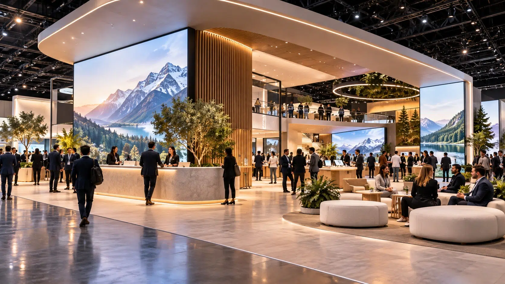
A big event space provides a brand with the freedom to display products, connect with clients, conduct demos, and convey its message. So what should the visitors do first? The plan should be based on that question. Begin by setting one goal, whether it be lead collection, product demos, sales meetings, or brand awareness. Then assign roles to each aspect of the booth.
For instance, if you’re launching a product, you might need larger spaces for demonstrations, or if you’re a B2B company, you might require larger meeting areas. Establish easy goals prior to the design process. This helps to determine which things should be on the floor and which shouldn’t.
Plan the Floor Space Around Visitor Movement
While a 20×20 booth equates to 400 square feet of floor area, not all of it needs to be filled with furniture or exhibits. The flow of visitors should be considered from the outset. Some factors that influence traffic flow, according to the International Association of Exhibitions and Events (IAEE), are booth activity, attendance numbers, aisle width, entrances, exits, demonstrations, and meeting areas.
Start by marking the main entry points. Now draw a basic line through the space. A visitor may view the brand message, approach a product display, observe a product demonstration, and then approach a meeting area.
Maintain open travel lanes. Avoid positioning a reception desk, large display, or demo unit that prevents access to another area of the booth.
A helpful format to use includes:
- An open entrance
- A good display of the brand.
- Product areas
- A demo zone
- Meeting tables
- Hidden storage
Be aware of venue rules before the final plan. The floor plan will depend on the type of booths being used and the venue for the event, so the precise floor plan will need to match the event site, IAEE points out.
Build a Clear Brand System Across the Space
A large booth can carry many visual elements, yet they should still look like one brand. Use the same logo, colors, fonts, image style, and message across walls, signs, product displays, and screens. EXHIBITOR recommends using a company style guide to keep exhibit graphics consistent. It also advises that type size should match the distance from which visitors need to read it.
Start with one main message. Put it in a place that visitors can see from the aisle. Use smaller signs for product facts and detailed information inside the booth. This creates a clear order instead of forcing visitors to read everything at once.
A simple message structure can work well:
- Brand — who you are
- Offer — what you provide
- Benefit — why it matters
- Proof — product facts, results, or examples
- Next step — what the visitor can do
Keep the main text short. A person walking past won’t stop to read a full paragraph. Large words and a strong image can communicate the first idea much faster.
Text size also needs a practical check. EXHIBITOR cites a common rule of about one inch of letter height for every three feet of viewing distance. So, if visitors may read a message from 12 feet away, letters around four inches tall provide a useful starting point.
Contrast matters too. EXHIBITOR notes that weak contrast can reduce readability, even when the text is large enough.
Before print, review the whole booth from the aisle. Ask: What do I see first? What do I understand next? If several signs compete for attention, simplify the design. A large space works better when every visual element has a clear job.
Give Products and Demonstrations Enough Room
A product demo needs enough room for the product, staff, and visitors. Before the booth plan is final, estimate how many people may watch each demo at one time. A small device may need only a counter, while large equipment can require a wider area and more space around it.
Place the demo where people can stop without blocking the main booth path. Keep screens and product samples easy to see from the aisle. If several products need demos, give each one a clear area rather than placing everything on one table.
A practical check should cover:
- Product and equipment size
- Staff position
- Visitor space
- Screen position
- Power access
- Cable routes
Keep spare boxes, cases, and tools out of public areas. A clean demo zone makes the product easier to see and gives staff enough room to explain it without crowding.
Use the Booth Height Without Blocking the Floor
A large booth can use vertical space for signs, graphics, and brand elements. This helps a company show its name from farther across the event floor while keeping more floor area available for visitors and products.
Start with the venue’s rules. Height limits, hanging signs, and structural requirements can differ between events, so the organizer’s manual should guide the final design.
Tall elements should have a clear purpose. A high brand sign can help visitors identify the booth before they reach it. A large graphic wall can carry the main message without taking up extra floor area. Product displays can also use shelves or raised platforms when the product and venue rules allow it.
Don’t place tall structures where they block important displays or make the booth feel closed. Keep the lower area open where possible.
Before production, view the design from the aisle. Check whether the company name, main message, and key products remain easy to see. Good height use adds visual presence without reducing useful floor space.
Add Meeting Areas That Fit the Event Goal
Meeting areas should match the type of conversations expected at the event. A company that plans short talks may need simple tables and chairs. A brand with longer sales meetings may need semi-private areas with more separation from the main visitor path.
Start with the expected number of meetings. Don’t fill the booth with seats that rarely get used. Place meeting areas away from busy demo zones, but keep them close enough for staff to move between meetings and product displays.
Consider:
- Number of seats
- Level of privacy
- Table size
- Visitor access
- Distance from main traffic paths
For private talks, enclosed rooms may be suitable if the event rules and booth plan allow them. For quick conversations, open tables often use less space and keep the booth more accessible.